With the increasing use of digital maps and navigation tools, having an effective website that reflects your brand is essential for gaining a competitive edge in the market.
Defining Brand Identity
A company’s brand identity is the combination of visual elements, such as its logo, colour scheme, typography, and imagery, that create a unique and recognizable brand image. By establishing a strong brand identity, you can differentiate a website from your competitors to make a lasting impression on audiences.
When designing a navigation and mapping website, brand identity should be reflected in every aspect of the design, from the colour scheme to the imagery.
Optimize you websites Navigation
Your navigation should be clear, concise, and easy to use, allowing your visitors to find the information they need quickly and efficiently. Well-designed navigation can also improve your website’s SEO by making it easier for search engines to crawl and index your pages.
When designing your navigation, you should consider the following best practices:
Use clear and descriptive labels for your navigation links
Group related links together to create a logical structure
Use drop-down menus for subcategories to avoid cluttering your main navigation
Choose a Responsive Design
With the increasing use of mobile devices, having a responsive website design is more important than ever. A responsive design ensures a website is optimized for all screen sizes, from desktop computers to smartphones and tablets. By using a responsive design, you create a seamless user experience across all devices, improving your website’s usability and SEO.
When designing any website, you should consider the following best practices for responsive design:
Use a responsive framework, such as Bootstrap, to create a mobile-friendly layout
Optimize your images and videos for mobile devices to reduce loading times
Use large fonts and clear calls to action to improve readability on small screens
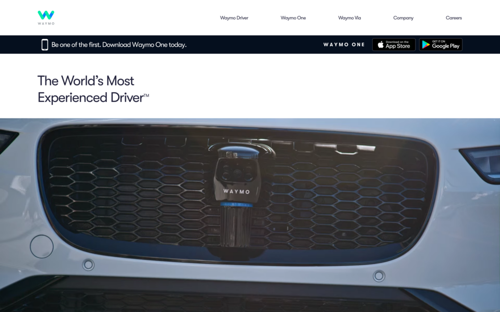
 Waymo
Waymo